
Q.utoronto.ca, it’s as easy as that.
The word Quercus may be hard to remember but getting onto the login page is simple! This is starting off well. Like Portal, you simply login with your UTORid. We get to a nice home screen, the Dashboard. It’s very clean and colourful, pleasant for the eyes.
I remember looking at Portal, it was like going into a dark forest with bumpy roads and just peaks of sunlight. While Quercus is the new bright path in the forest full of sunshine but, of course with a few clouds on the way.
For those who just got used to Portal, don’t be mad Quercus is much easier to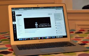 use, and those who have been using Portal for most of their university courses, think of Quercus as the latest phone with all its features. I feel like all new technology is like a shiny new phone. You are excited and use it all the time, looking around and through the different features, and customizing it to your liking. But after every new phone you get tired and used to the same old system, same old features.
Quercus in this sense is different, it is continuously changing and I think that’s what I like about it compared to Portal. Each course you take will mostly be designed differently than the last.
Quercus is like a website with changes and updates. The professor can either be creative with their design or just use a basic stream of style. But each course still has its own unique flare to it.
Let’s do a list of what Portal has and what Quercus has and you can can tell me which is better!
Portal = grey, dull, confusing, TOO MANY FOLDERS!!, same for all courses Quercus= colourful, bright, simple, NO FOLDERS!, unique for each course
Okay I understand I sound biased BUT don’t say anything until you have logged into q.utoronto.ca.
Additional Resources:
Guide:
-Sankhi Liyanage